

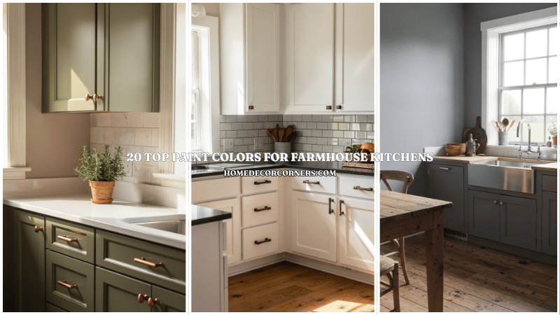
I spent three hours yesterday staring at sixteen different shades of “white” paint. If you’ve ever felt like you’re losing your mind over the subtle difference between “Eggshell” and “Swiss Coffee,” welcome to the club. Picking the right color for a farmhouse kitchen feels like a high-stakes gamble because, let’s face it, nobody wants to repaint those cabinets twice.
The classic farmhouse look thrives on a balance of warmth and utility. We want that cozy, “I just baked a pie” vibe without making the room look like a literal barn from the 1800s. I’ve narrowed down the absolute best shades that actually work in real-life lighting, not just in filtered Pinterest photos.
The Holy Grail of Whites and Creams
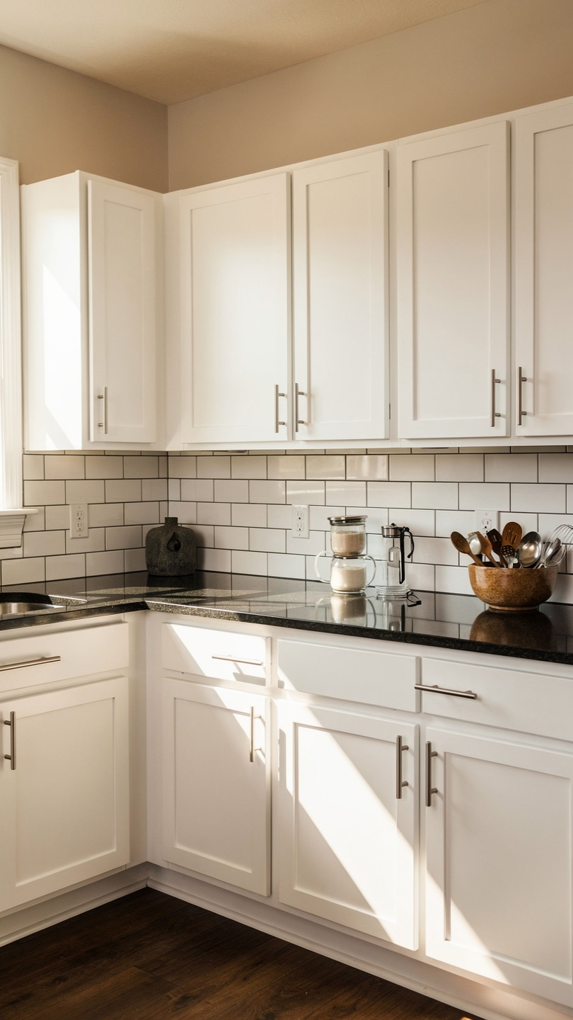
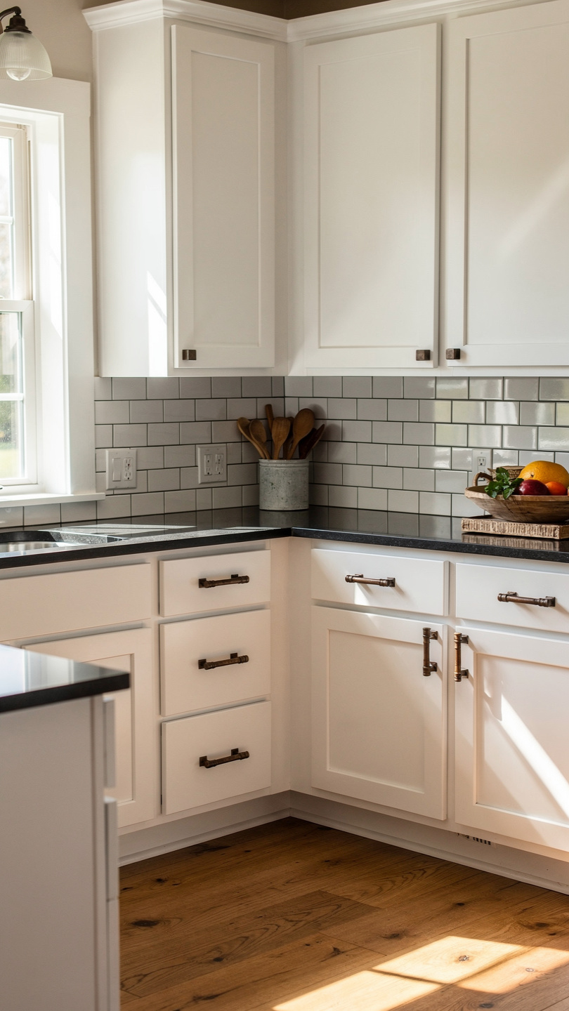
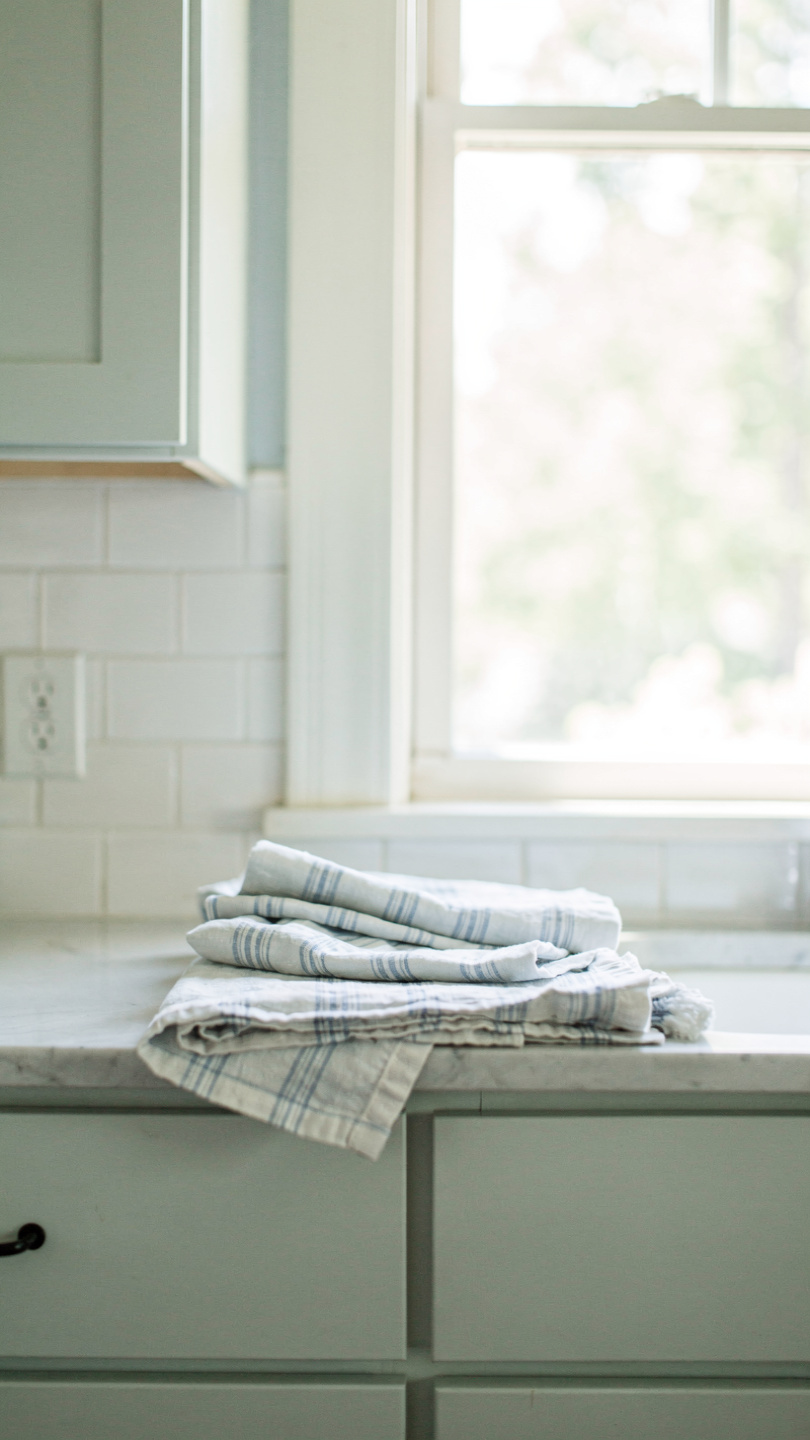
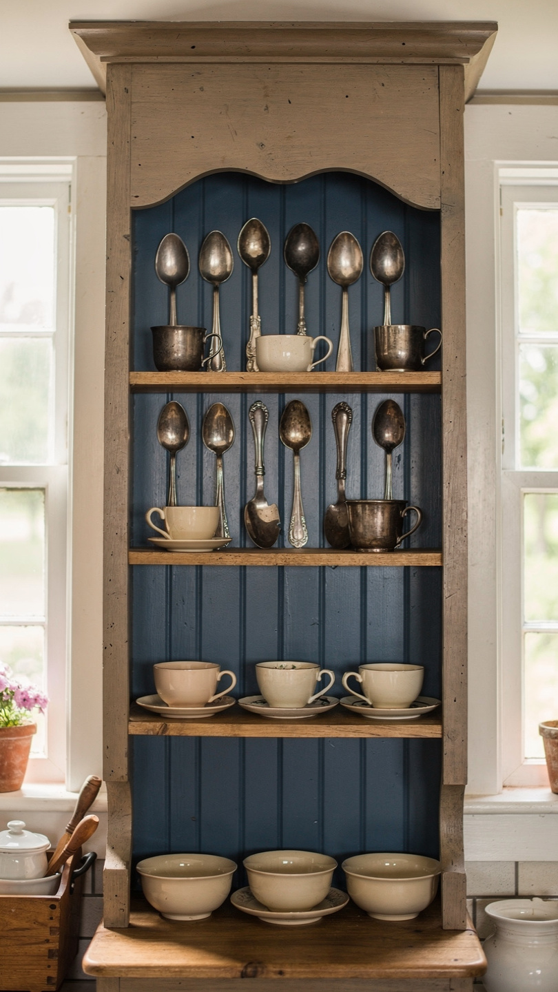
White is the backbone of the farmhouse aesthetic. It makes a small kitchen feel huge and provides a crisp backdrop for those chunky wooden floating shelves. But pick the wrong one, and your kitchen will either look like a sterile hospital wing or a dusty attic.
1. White Dove by Benjamin Moore
I call this the “Goldilocks” of whites. It isn’t too yellow, and it definitely isn’t too blue. It creates a creamy, soft finish that plays beautifully with natural wood accents. I used this on my own pantry doors, and it hides just enough “lived-in” dust to keep me sane.
2. Alabaster by Sherwin-Williams
Ever wondered why every interior designer obsesses over Alabaster? It offers a warm, inviting undertone that feels substantial. It mimics the look of aged whitewash without the actual peeling mess. If you have warm-toned hardwood floors, this color belongs on your walls.
3. Swiss Coffee by Behr
Don’t let the name fool you; it doesn’t look like a latte. It is a refined, off-white that looks incredibly expensive. It provides a slightly more “heritage” feel than a bright gallery white. I recommend this if you want your kitchen to feel like a cozy cottage.
4. Simply White by Benjamin Moore
This shade brings the heat—literally. It has a hint of yellow that makes the kitchen feel like it’s constantly bathed in sunlight. It works perfectly for cabinets if you want them to pop against a darker countertop. Just keep it away from cool-toned marble, or things might look a bit clashing. 🙂
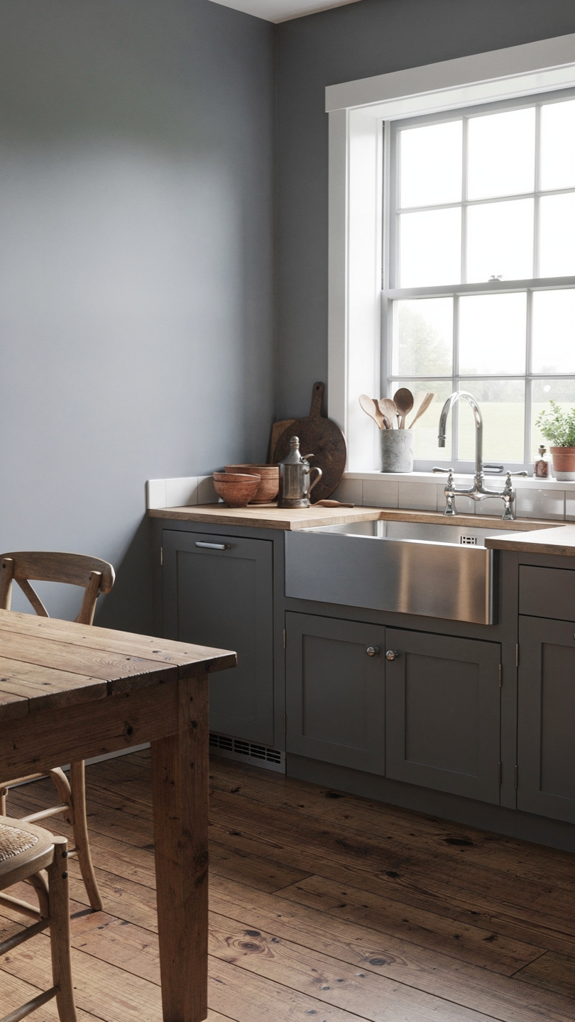
Moody and Modern Farmhouse Grays
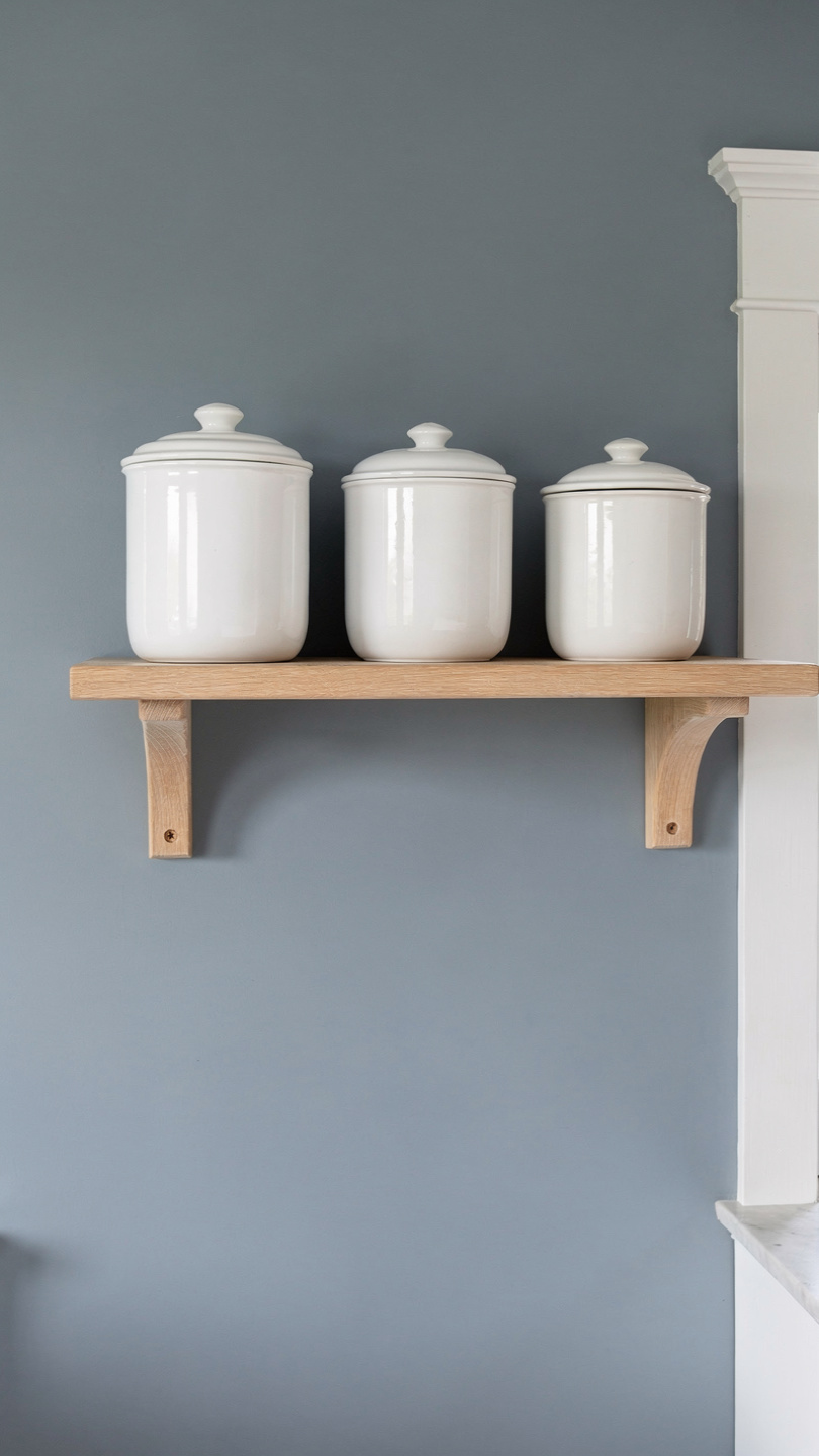
Gray isn’t dead; it just evolved. The “millennial gray” era of 2015 is over, thank goodness. Today’s farmhouse grays have depth, character, and soul. They lean into “greige” territory, which means they actually look good next to a brown cutting board.
5. Revere Pewter by Benjamin Moore
This is the ultimate transition color. It sits perfectly between gray and beige, making it the most versatile shade on this list. It adapts to the lighting throughout the day, looking cool in the morning and warm at night. IMO, it’s the safest bet for anyone who hates making decisions.
6. Agreeable Gray by Sherwin-Williams
The name really says it all—it just agrees with everything. It provides a clean, neutral backdrop that allows your black hardware to stand out. I’ve seen this in dozens of kitchens, and it never looks dated. It’s the “jeans and a white t-shirt” of the paint world.
7. Repose Gray by Sherwin-Williams
If you want something a bit cooler, this is your winner. It has slight purple and blue undertones that keep it feeling fresh. It looks stunning when paired with white subway tile and stainless steel appliances. Just make sure you test a swatch, as those undertones can surprise you in north-facing rooms.
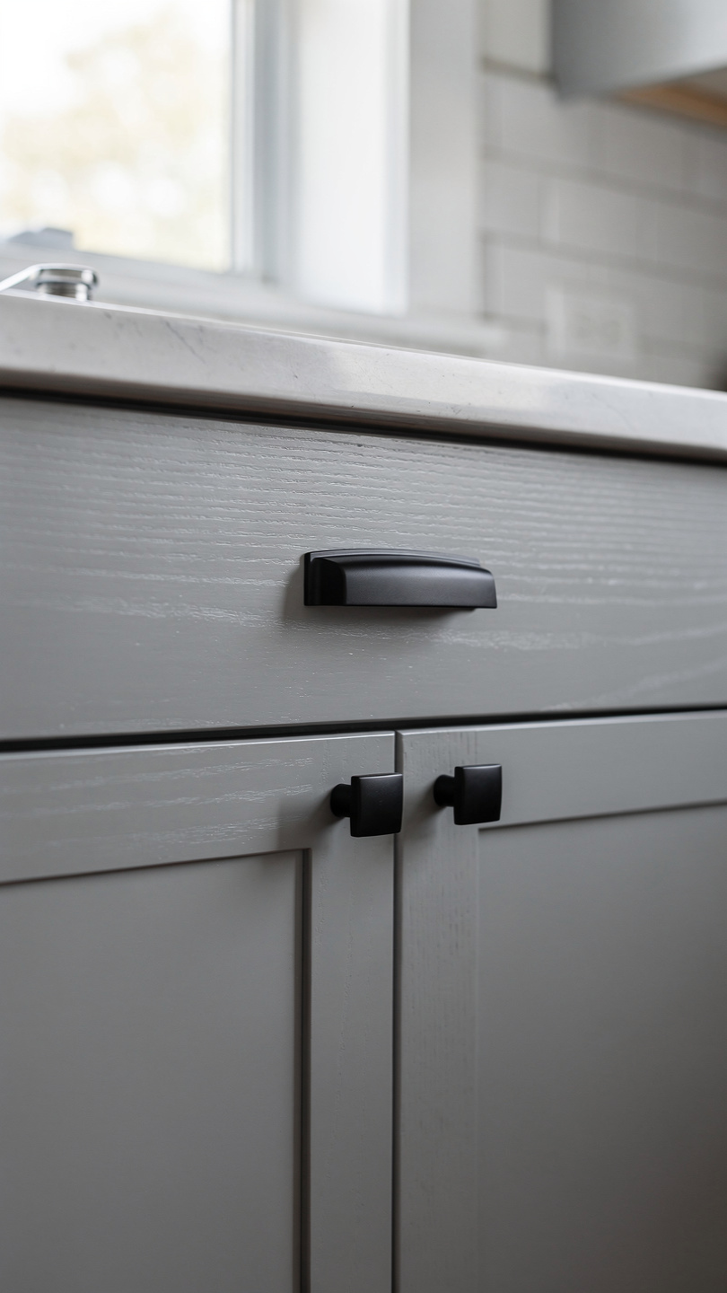
8. Iron Ore by Sherwin-Williams
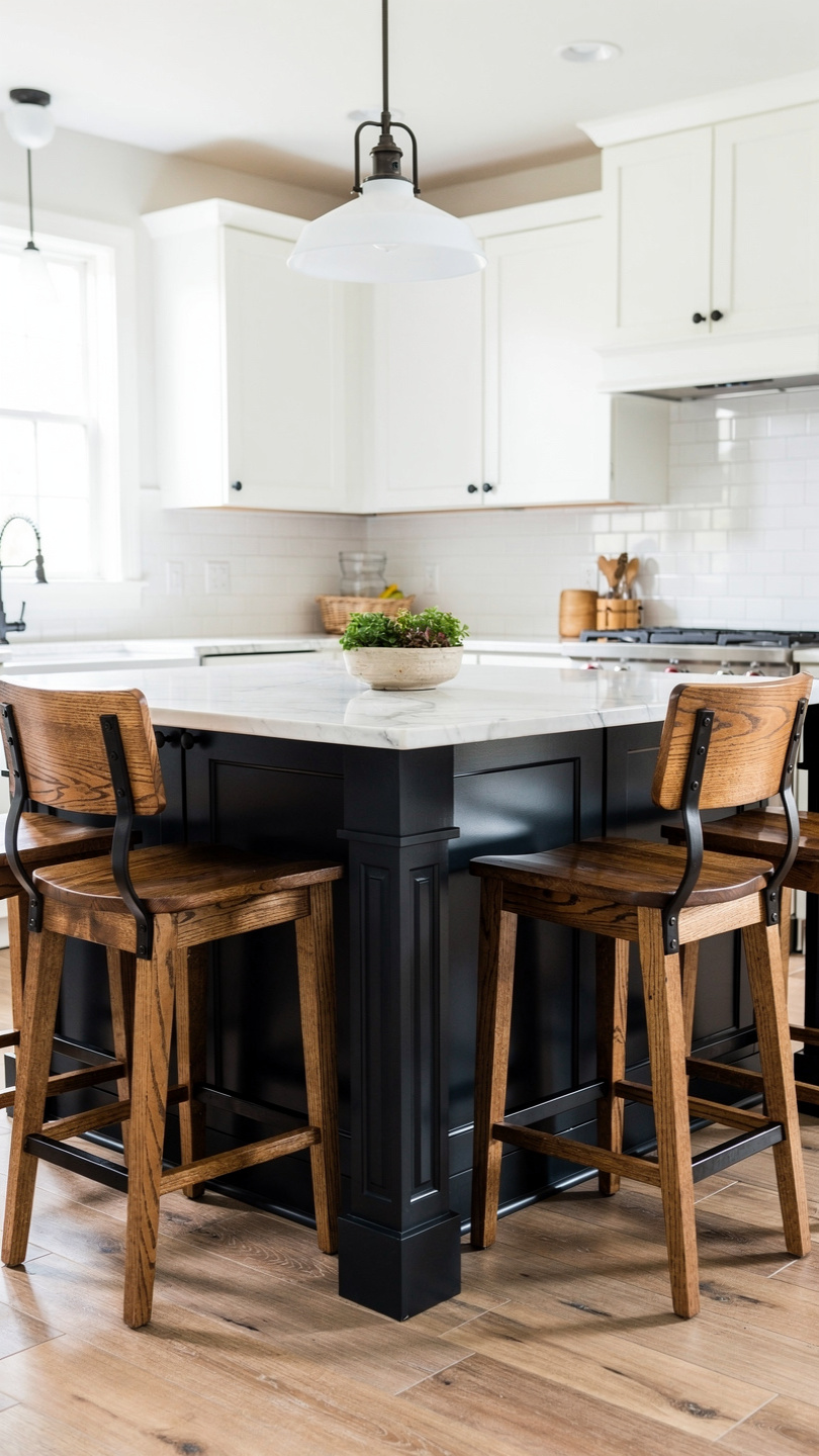
Who says farmhouse kitchens have to be light? A dark, charcoal gray on an island or lower cabinets adds massive drama. Iron Ore isn’t quite black, which makes it feel softer and more sophisticated. It hides the scuff marks from your kids’ shoes better than any white paint ever could.
Nature-Inspired Greens
Green is currently having a massive “main character” moment in kitchen design. It brings the outdoors in and feels incredibly organic. Plus, it looks spectacular next to brass or copper hardware.
9. Saybrook Sage by Benjamin Moore
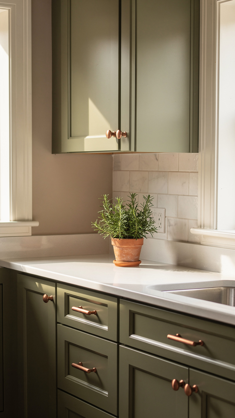
This color screams “herbal garden.” It is a muted, earthy green that feels calming and timeless. I love seeing this on shaker-style cabinets with a white quartz countertop. Does anything feel more “farmhouse” than a sage green kitchen?
10. Pigeon by Farrow & Ball
Don’t be put off by the name—pigeons are actually quite stylish, apparently. This is a blue-grey-green that looks different every time you look at it. It has a “muddy” quality that feels historic and high-end. It’s a bit of a splurge, but the depth of pigment is worth every penny.
11. Olive Glow by Behr
For those who want a bit more “oomph,” this deep olive delivers. It creates a moody, cozy atmosphere that feels like a hidden tavern. I suggest using this on a kitchen island to create a focal point without darkening the whole room.
12. Sea Salt by Sherwin-Williams
This is the lightest green on the list, often looking more like a gray-green-blue. It feels airy and coastal, which works great if your “farmhouse” is near a beach (lucky you). It keeps the kitchen feeling bright while adding a whisper of color.
Classic and Moody Blues
Blue is a fantastic alternative to gray. It feels intentional and classic, especially in homes with a lot of white trim. Whether you want a soft sky blue or a deep navy, these shades hit the mark.
13. Hale Navy by Benjamin Moore
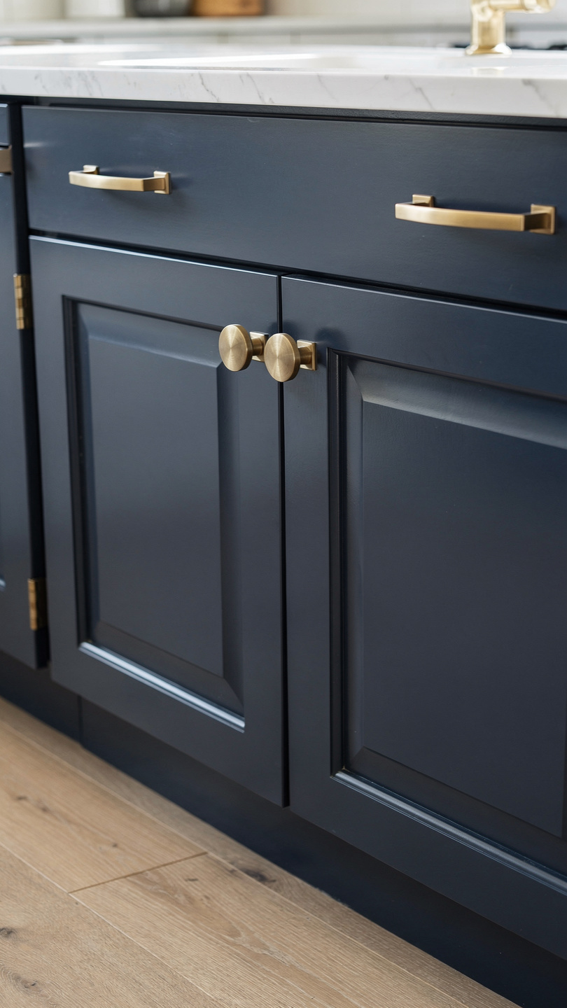
Every list of top paint colors needs Hale Navy. It is a deep, true navy that acts like a neutral. It looks incredible on lower cabinets, grounding the space. Pair it with gold handles for a “modern farmhouse” look that feels totally polished.
14. Boothbay Gray by Benjamin Moore
Despite the name, this color reads as a beautiful, dusty blue. It has enough gray in it to keep it from looking like a nursery. It feels sophisticated and pairs perfectly with light oak flooring. I personally think this is the most underrated blue in the industry.
15. Denim Drift by Dulux
This shade offers a relaxed, worn-in feel. It reminds me of a favorite pair of jeans. It works well in kitchens with lots of natural light, preventing the blue from feeling too “icy.” It’s a great choice for a backsplash area or a built-in hutch.
16. Van Courtland Blue by Benjamin Moore
This is a mid-tone blue that feels very “Old World.” It has a timeless quality that suits farmhouse architecture perfectly. It looks best when surrounded by warm whites and antique brass accents.
Unexpected Warm Tones
Sometimes, we need to break away from the “cool” palette. Warm tones like terracotta, mushroom, and soft yellow are making a huge comeback. They make a kitchen feel like the heart of the home rather than just a place to boil pasta.
17. Shaker Beige by Benjamin Moore
If you want to lean into the “mushroom” trend, this is your starting point. It’s a warm, sandy beige that feels incredibly cozy. It provides a beautiful contrast against bright white trim. FYI, this color makes your morning coffee routine feel 10% more aesthetic.
18. Setting Plaster by Farrow & Ball
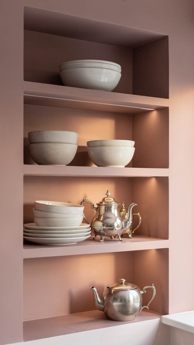
This is a dusty, sophisticated pink that somehow acts as a neutral. It doesn’t look “girly”—it looks like old European plaster. It brings a glow to the room that makes everyone look better in the morning light. It’s a bold choice, but the payoff is massive.
19. Woodmont Cream by Benjamin Moore
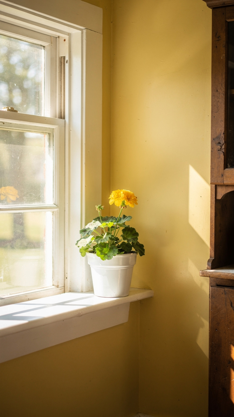
This isn’t your grandma’s yellow. It is a buttery, soft cream that feels cheerful without being loud. It works wonders in kitchens that don’t get much natural light. It literally “turns on the sun” in a dark corner.
20. Urbane Bronze by Sherwin-Williams
We’re ending with a heavy hitter. This is a warm, brownish-gray that feels organic and grounded. It mimics the look of aged bronze or dark stone. If you have a large kitchen and want to make it feel more intimate, this is the color for you.
Quick Comparison Table for Decision Fatigue
If you’re currently drowning in paint chips, use this table to narrow your search based on the “vibe” you want.
| Color Name | Brand | Best For | Undertone |
| White Dove | Benjamin Moore | Cabinets & Trim | Creamy / Warm |
| Hale Navy | Benjamin Moore | Kitchen Islands | Deep Blue |
| Saybrook Sage | Benjamin Moore | Shaker Cabinets | Earthy Green |
| Iron Ore | Sherwin-Williams | Lower Cabinets | Charcoal |
| Revere Pewter | Benjamin Moore | All-over Walls | Greige |
| Pigeon | Farrow & Ball | Accent Walls | Blue-Green |
How to Choose the Right Finish
Selecting the color is only half the battle. You also have to pick the finish, or “sheen.” This matters because kitchens are high-traffic zones where things get spilled, splashed, and occasionally thrown.
- Satin: This is the gold standard for farmhouse cabinets. It offers a soft glow and stands up to frequent wiping.
- Eggshell: Use this for your walls. It hides imperfections better than a shiny finish but still allows you to scrub off that rogue splash of pasta sauce.
- Semi-Gloss: Reserve this for trim and baseboards. It’s the toughest finish and handles the vacuum cleaner bumps like a champ.
Common Paint Mistakes to Avoid
I’ve made plenty of mistakes so you don’t have to. Here are a few things that can ruin a perfectly good paint job:
- Ignoring the Light: A color that looks great in the store will look different in your kitchen. Always test a large swatch on multiple walls.
- Skipping the Primer: If you’re painting dark cabinets white, use a high-quality primer. Otherwise, that dark wood grain will haunt you forever.
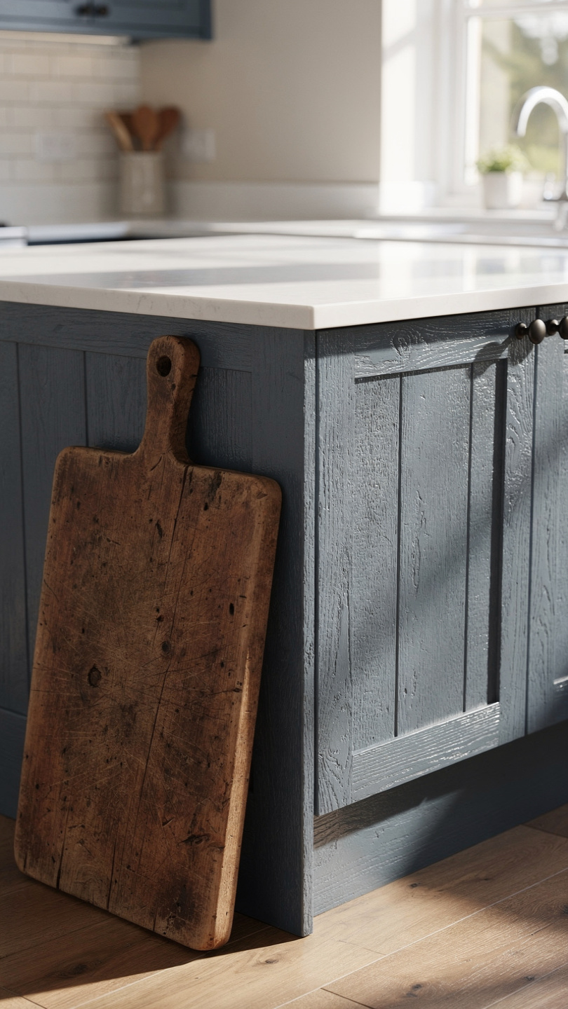
- Matching Too Perfectly: Farmhouse style thrives on a bit of “mismatch.” Don’t try to make your paint exactly the same shade as your tiles. Let them complement each other instead.
Wrapping It Up
Choosing a paint color shouldn’t feel like a chore. At the end of the day, it’s just paint! If you hate it, you can change it (though your arms might hurt from the effort). Whether you go for a classic White Dove or a moody Iron Ore, make sure the color makes you happy when you walk in for that first cup of coffee.
The “farmhouse” look is all about comfort and personal history. Pick a shade that highlights your favorite cutting board or that vintage rug you found at a flea market. Which of these 20 colors sparked an idea for your kitchen? Happy painting!